
End of the Road
Written by: Jade Ryerson
Remember the dark days of the Internet when tweets were capped at 140 characters? To draft an alluring, pithy message somewhere between 20 and 40 words is no easy task. For someone who’s naturally verbose like me, it can be even more arduous to keep any statement expressive and specific, yet brief.
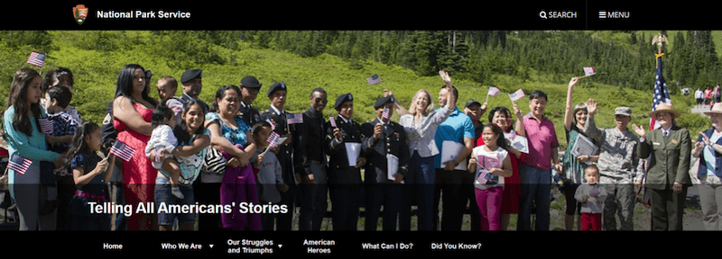
This summer, I faced a related challenge while wrapping up the final week of my internship. I’ve spent much of the past few weeks striving to meld the form and content of my “Pathways Through American History” into one coherent digital concept. In collaboration with my amazing, supportive, and flexible team, we’ve pivoted the layout to incorporate more images and shed the appearance of a finding aid, or as though it was copied-and-pasted from a text document. We decided to adjust from our initial plan to implement drop-down menus in lieu of something called a “graphic grid.” These changes will hopefully achieve the end goal of making the resource appealing and usable.
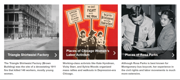
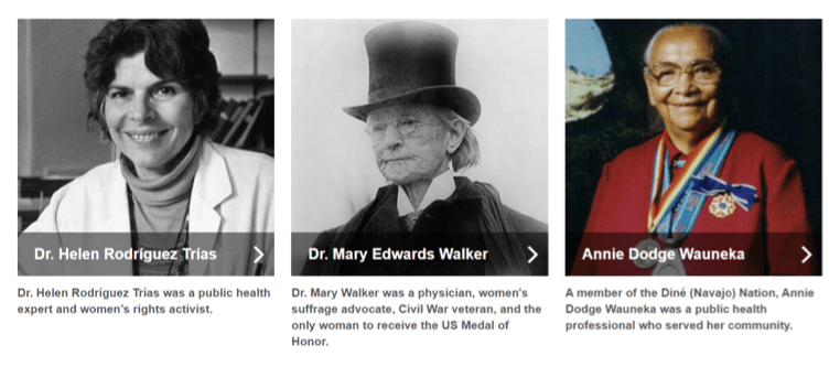
I’ve learned a lot through trial and error. When we started building using the graphic grid format, we realized that some of the thematic connections between different articles weren’t as obvious or implicit as I had initially thought. For instance, Rosa Parks and many other historical figures had complex, multi-faceted lives, even though we often only associate them with one movement or event. For Parks, the association is typically with the Civil Rights Movement. Because of that, an interested, yet uninformed public might not understand why I grouped Parks with labor activism without additional context.
To aid in users’ understanding, I drafted some text that would preview what each resource is and demonstrate how it related to the others grouped with it. But there’s a fine line between including text to help situate the user and making the page look cluttered. Although NPS.gov’s Content Management System (CMS) already presented some design constraints, its built-in character counts actually proved useful in this case. For the graphic grid text, we’re capped at 140 characters for each element featured in the grid. As a result, I found myself performing the tricky task of writing tweet-length summaries of our selected content.
As I continue to learn about how to facilitate the best possible experience for digital users, I admit that CMS has been an exacting, yet effective teacher. As the Pathways Through American History guides have come together, so too has my understanding of user experience. I’ve definitely become more mindful of just how much thought and effort goes into building the many, many web resources on NPS.gov and will keep it top of mind when I tackle future projects. I’m grateful that the American Conservation Experience and the National Park Service Cultural Resources Office of Interpretation and Education made it possible for me to have this rewarding opportunity this summer.